Choosing a wedding guest outfit involves more than finding a dark jewel tone. The dress code, the fabric’s finish and the shoes you can stand in all affect the result. A Deep Winter palette can help narrow the colors, provided you test them in the complete outfit and leave room for personal taste.
Read the invitation before the color chart
Start with the stated dress code and any requests from the couple. A floor-length gown, tailored suit and relaxed linen set occupy different levels of formality even when they share the same dark blue. If the wording is unclear, ask the hosts or consult their wedding information. A seasonal label cannot tell you whether a particular outfit suits the occasion.
The venue and timing add practical constraints. A garden ceremony may involve grass and a long period in the sun; an evening reception may mean air conditioning and photographs after dark. Choose shoes, coverage and fabric with that sequence in mind. A beautiful heavy velvet can be uncomfortable outdoors in warm weather, while a light dress may need a separate layer later.
Deep Winter color analysis is commonly associated with dark values and a cool leaning palette, although different systems draw the boundaries differently. Use that description to choose a few candidates, then inspect the clothes. It does not require a particular garment, complexion, age or style. Your comfort and the event’s expectations remain part of the decision.
Find depth beyond the black dress
If black feels too familiar, compare ink navy, dark berry, aubergine and a deep blue-green. The names on shop pages are unreliable: “wine” can mean a brownish red or a much cooler berry, while “teal” covers a wide range. Place the actual fabric beside a known garment in daylight before deciding which direction you enjoy.
Depth does not have to mean a color so dark that it disappears. Hold a navy candidate next to black and look at it from several steps away. Can you still see the blue? That may matter if the color itself is what attracted you. A slightly lighter version can retain a dark overall impression while showing more clearly in ordinary indoor light.
I would keep the shortlist to two or three shades at first. Compare one familiar option with one alternative, using the same jewelry and shoes. If every candidate has a different neckline and silhouette, it becomes difficult to know whether you are choosing a color or a cut. Where possible, compare colorways of the same garment.
| Color direction | Possible outfit | Check before committing |
|---|---|---|
| Ink navy | Tailored suit or fluid midi dress | Whether it still reads blue in the reception lighting |
| Dark berry | Matte crepe separates or a draped dress | Whether the red leans brown or clear beside your accessories |
| Aubergine | Simple column shape or a structured jacket | How much purple remains visible in shadow |
| Deep blue-green | Dressy jumpsuit or flowing skirt and top | Whether the fabric’s sheen changes its apparent lightness |
Judge the color in the fabric you will wear
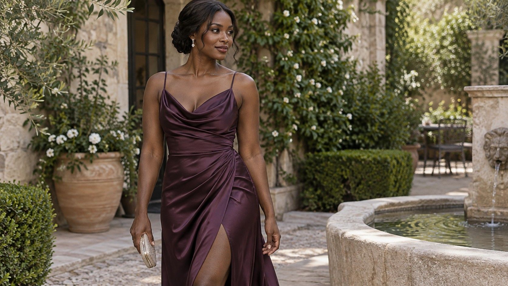
A digital deep winter color palette is flat; an outfit moves. Satin catches bright highlights and forms dark folds, velvet changes with the direction of its pile, and sequins reflect the surroundings. Two garments sold as the same burgundy can produce very different effects. Use a swatch where available, but make the final decision with enough fabric to see its behavior.
Move the garment rather than judging it only on a hanger. Sit, take a few steps and turn beside a window. A shiny fabric may create pale flashes that you enjoy, or it may feel more conspicuous than expected. A matte weave can make the same hue feel steadier. Neither finish is inherently more appropriate for a season.
Also check construction in ordinary light. Thin fabric can become more transparent when stretched across a knee or back; linings may show at a slit or neckline. Try the underwear and any smoothing layers you intend to wear, and check that the fabric still falls comfortably. These are reasons to keep or return a garment regardless of how neatly it fits a color description.
Build the supporting pieces around one decision
Once the main outfit is chosen, put it beside your shoes, bag and outer layer. A dark berry dress might work with black shoes you already own, while navy can sit comfortably with pewter-colored accessories. You can also repeat a similar dark hue. There is no obligation to create a sharp contrast if you prefer a quieter arrangement.
For jewelry, compare finishes at the neckline. Polished silver-colored pieces reflect much more light than a small brushed pendant; dark metal can almost disappear against a deep fabric. If the outfit has a busy neckline, a simpler earring may be easier to wear than several competing pieces. Choose for the complete composition and your own taste, rather than treating metal color as a rule.
Makeup, if you wear it, deserves the same practical trial. A berry lip can repeat a color already present, but a neutral lip is equally available. Test products you know you find comfortable, particularly if there will be food, heat or a long journey. Seasonal color analysis cannot predict wear time or how much maintenance you want during the event.
Give the coat or wrap a proper place in this test. It may appear in arrival photographs and stay on throughout the ceremony. An almost-right layer borrowed at the last minute can change the outfit more than an accessory. Check its length with the hem and whether it stays secure when your hands are occupied.
Make a dark palette work for the setting
A daytime wedding does not automatically require pale colors. A dark blue outfit in a light, moving fabric may feel quite different from the same hue in dense velvet. Where the dress code allows, an open neckline, a smaller accessory or a print with some space between motifs can alter the overall weight without abandoning colors you like.
Check prints from a distance. A tiny pale pattern may blend into a lighter overall effect, while a few large white flowers remain distinct. If the hosts have requested that guests avoid white, consider the garment’s overall appearance and their wording; ask if you are unsure. Calling a print part of a Deep Winter palette does not settle wedding etiquette.
For an evening event, do a second check under the lamps available at home. This will not reproduce the venue precisely, but it can reveal whether two dark pieces merge or clash in a way you dislike. Try a different bag or a more distinct fabric texture before concluding that you need a different dress. Often the main garment is perfectly usable with a small adjustment.
Do a complete rehearsal while returns are possible
Try everything together before the return deadline, including the shoes, underwear and outer layer. Sit for several minutes, lift your arms and walk the distance of a hallway. Check hems with the intended heel height and practice using any fastenings you cannot easily reach. An outfit that feels restrictive at home is unlikely to become easier during a long reception.
Use indirect daylight for the main color comparison, then take a few reference photos with the same lighting and camera settings. Phone images can shift hue and contrast, so rely on your eyes for the fabric itself. The pictures are useful for checking proportions and remembering combinations, especially if you are deciding between outfits on separate days.
Before buying another accessory, note what is actually missing. You may need a stable shoe for grass, a pocket for essentials or a layer suitable for the ceremony. Those needs are more concrete than a vague sense that the outfit needs “finishing.” Borrowing or rewearing a piece is worth considering when it solves the same problem.
A deep winter colour analysis label can provide a manageable starting set of colors. The successful purchase is the one that meets the dress code, survives the movement test and feels like something you would choose again. Keep a note of the fabric and color combination you enjoyed; that is a useful reference for the next invitation.