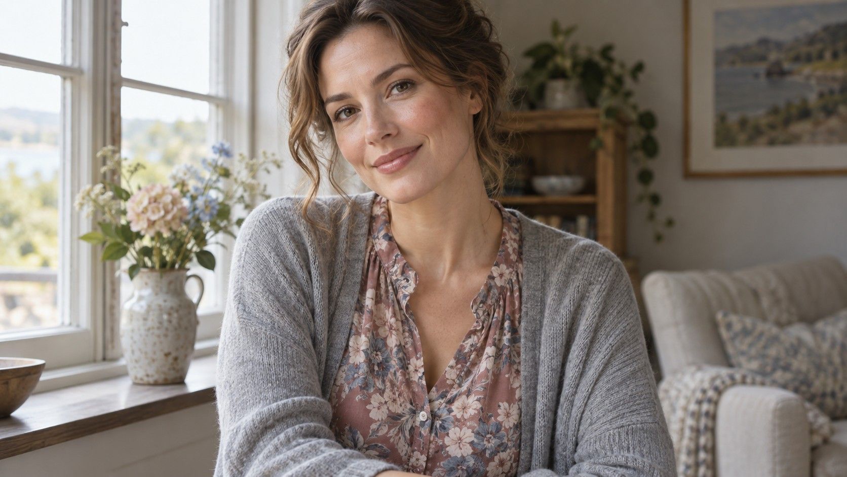
A floral blouse can contain several colors from a Soft Summer chart and still feel much sharper than expected. The size of the flowers, their edges and the amount of background all affect what you see. Choosing a print becomes easier when you compare those features separately, using the clothes you already enjoy as a reference.
Look at the whole garment before inspecting each color
A print is experienced as a whole before anyone identifies its individual shades. Hang a candidate a few steps away, or ask someone to hold it at approximately the height you would wear it. Notice whether it reads mainly as blue, gray, pink or simply a strong light-and-dark pattern. That overall impression may matter more to your outfit than a tiny patch of an approved color.
Soft Summer color analysis commonly describes a relatively muted, cool leaning palette, though the boundaries vary between systems. A dusty blue ground with softened rose motifs is a reasonable starting comparison. It is not a requirement to choose flowers, faded effects or romantic styling. A geometric design can have the same restrained color relationships.
Cover part of the garment to see which area carries the impression. A print with a pale background and a few dark leaves behaves differently from a mostly dark print with pale dots. If you love the first on the hanger but dislike it beside your usual trousers, the amount of pale space may be the issue. You have learned something more useful than whether every color belongs on a chart.
I would keep one familiar printed garment nearby while comparing new ones. It provides a real reference for the density and color relationships you tend to wear. A saved image can help with the motif, but it cannot reproduce the texture or the way a fabric catches light.
Separate a soft edge from a low contrast color scheme
Low contrast means the colors have relatively little visible separation; soft edges mean the boundaries between shapes are blurred or irregular. They can occur together, but they are different features. A watercolor print can still contain a very dark navy beside an almost white patch. A sharply drawn check can use two closely related blue grays and feel quieter overall.
Compare the lightest and darkest parts first. Hold the fabric beside a plain mid-gray garment, then step back. Does your attention go immediately to small dark shapes? Is that an effect you enjoy? You do not need to remove every noticeable element. The aim is to decide how much activity you want from this particular piece.
Next, look at the difference in saturation, sometimes called chroma. A clear turquoise line against muted gray may attract attention even when the two colors are similar in lightness. Conversely, several muted hues can sit comfortably together despite a moderate difference in value. This explains why judging a print only by its background can lead to surprises.
A black-and-white phone conversion may make the value pattern easier to see, but it removes information about hue and saturation. Use it as one comparison, then return to the fabric. Your phone may also adjust contrast automatically, so a processed image should not be treated as a measurement of the garment.
Choose motif size according to the effect you want
Softness does not dictate small prints. A large leaf in closely related gray and blue can feel calmer than a tiny dot pattern with a strong contrast. Try to separate the size of the motif from its color difference. If a large print appeals to you, compare a muted version before deciding that large designs are the problem.
Check the garment on your body or a form with a similar drape, because the cut breaks up the pattern. A flower that looks balanced across a flat length of fabric may be cropped by a seam or folded under a lapel. Examine the front closure, bust area, pockets and hem. You may have a preference about placement that has nothing to do with seasonal color.
Scale also changes with viewing distance. Small checks can merge into a single tone across a room; broad stripes remain distinct. If you wear the garment for video calls, inspect the preview as well. Fine repetitive designs sometimes produce distracting screen patterns. That is a reason to choose a different print for calls, without rejecting it for everyday wear.
Leave room for the style you actually like. Someone drawn to bold abstract shapes may find a tiny faded floral unsatisfying even if its colors seem suitable. A quieter color scheme within a favorite motif is often a more useful experiment than adopting a completely different wardrobe personality.
Pair the print with a solid you can repeat
Choose a solid from one of the larger areas in the print rather than chasing its smallest accent. A slate blue trouser can support a blue-and-rose blouse even if it does not match exactly. Compare both pieces in daylight. A close but visibly different shade may look intentional when their textures differ, or it may be a pairing you do not enjoy.
For a simpler test, keep the same plain bottom half and try two printed tops. This controls one part of the outfit and makes the comparison clearer. Then reverse the exercise with a printed skirt or trouser and a familiar knit. The print does not need to sit near your face to be part of an outfit you like.
If combining prints, give yourself one point of continuity. Similar background colors can connect a fine stripe and a larger abstract motif. Alternatively, repeat one muted hue while allowing the scales to differ. Inspect the result from a few steps away. When every area seems equally busy, a plain cardigan or jacket can provide a resting space.
Accessories need not reproduce every color in the pattern. A bag in a familiar neutral and shoes you already wear can be enough. Before buying a matching scarf, ask whether you want more pattern near the neckline or whether the blouse has already supplied the amount of detail you enjoy.
Treat darker Soft Summer charts as comparisons
You may encounter a deep soft summer color palette or the wording soft summer deep color palette while searching for richer options. These labels are used differently by different analysts and brands. They are not a single agreed category. Look at the actual examples and ask whether they describe lower lightness, stronger contrast, greater saturation or some combination of those qualities.
For a darker print, try a muted navy background with slate, rose or subdued blue-green motifs. Compare it with a paler version of a similar design. Keep the neckline and fabric as consistent as possible. If you prefer the darker example, that preference does not by itself establish a new seasonal classification.
You can also control the amount of darkness through layering. A dark printed top beneath an open gray cardigan shows a smaller area of the print; the same top worn alone has a larger role. Try both arrangements before returning a piece solely because it looks dark against a pale color chart.
The useful record is specific: “Muted navy ground works with the gray trousers; pale pink ground feels too light for this outfit.” Such notes help with the next purchase. A claim that a print is universally right or wrong for Soft Summer offers much less guidance about what to change.
Check an online order while you can still return it
On a product page, inspect both the close-up and the full outfit photograph. The close-up shows edges and texture; the wider image reveals how the colors blend at distance. Look for a view of the back and seams too. If the page shows only a small flat swatch, there is limited evidence about placement and overall effect.
Color names and screen displays cannot guarantee a match. When the parcel arrives, compare the garment with a familiar solid in indirect daylight, away from a brightly colored wall. Check it under the indoor lighting where you will usually wear it as well. Do this before removing labels or arranging alterations.
Move and sit in the garment. Pleats, stretched areas and gathered sleeves can compress motifs into denser patches. A sheer outer layer may look different over white, gray or your chosen underwear. Assess the actual combination you intend to wear instead of judging the printed layer on its own.
Keep a short note or reference photo of the successful pairing, with the lighting caveat in mind. Over time, a small collection of wearable examples becomes more informative than a long list of permitted shades. A soft summer color palette can narrow the search; the finished outfit tells you whether this particular print deserves a place in your wardrobe.